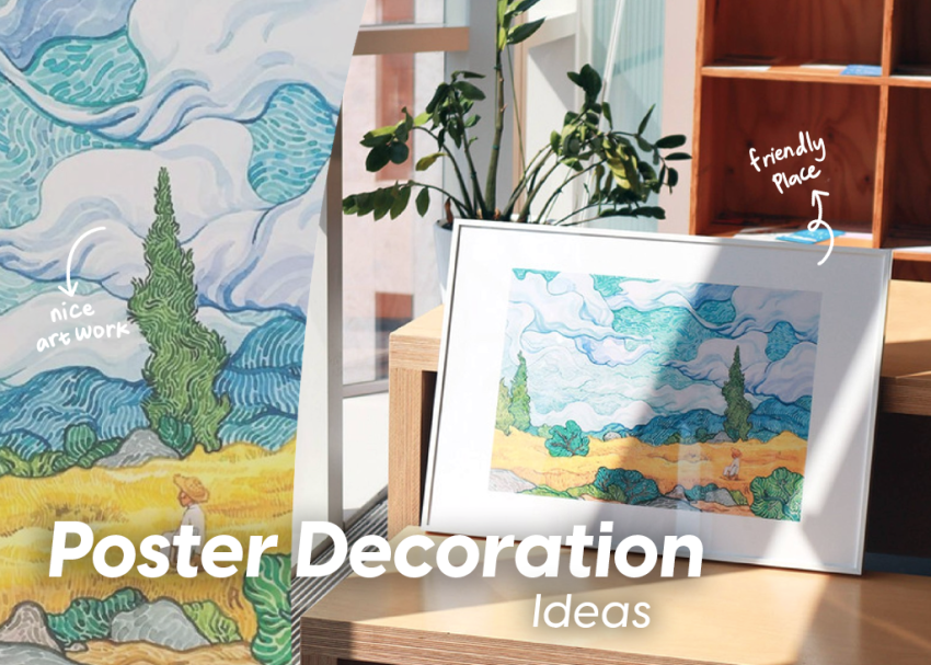
Poster decoration ideas offers many benefits to beautify your room. It has the ability to create an expressive and personal atmosphere in the home. Moreover, you can use posters with any image you want. The cost is also relatively cheaper than original works of art such as paintings. Apart from that, posters can also help cover damage to the walls.
Putting up poster decorations ideas is an easy way to beautify your home. However, you should not arrange them carelessly to create a harmonious appearance. If you are not careful, the room can look messy and unsightly. To prevent this, you need some tips and tricks to assemble the poster perfectly. If you need help styling your decoration poster artistically, check out some tips below!
1. Poster Installation Preparation and Locations
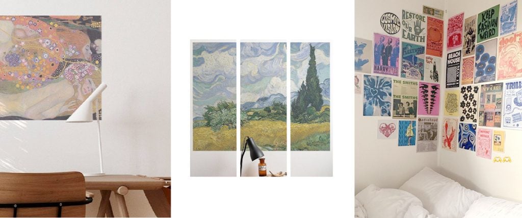
Good installation preparation can make the installation process easier. Meanwhile, determining the location is useful for maintaining harmony in the room. First, ensure your hands are clean and dry if your poster is self-adhesive. That will help the poster stick well and last longer. You can also use a wall ruler for neat and precise results
For the installation location, avoid exposing the poster directly to sunlight so that the color does not fade easily. Consider high-traffic areas where people spend their time, such as the living room, hallway, or home office. You can also sketch the layout first to make installation easier.
2. Poster Grouping
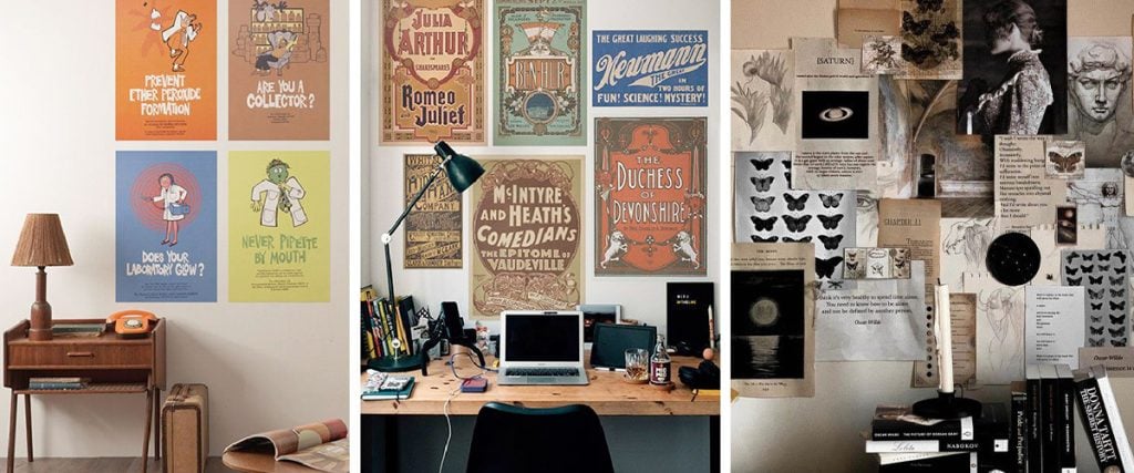
If you have a lot of posters, group them by similar themes or styles. Good grouping helps you install your posters neatly and harmoniously. There are two ways to arrange posters: symmetrical and asymmetrical. Symmetrical posters look best with vertical or horizontal shapes, while asymmetrical posters require a mix of both. Make sure to blend the asymmetrical posters well to make them look good together.
3. Choose a Poster Color and Styles Based on Your Room’s Palette
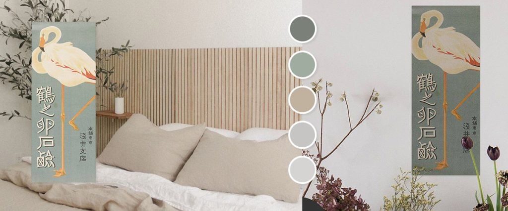
Consider the color and room style when choosing a poster. Look for posters that complement the dominant color of your room. For example, if the room has cool colors like blue and green, consider a poster with a warm color like orange or yellow to create a balanced look. Additionally, if your room has a modern, minimalist design, choose posters with clean lines, geometric shapes, or abstract. Remember, these guidelines serve to provide general direction. Ultimately, your personal taste and preferences should guide your choice.
4. Using Frames
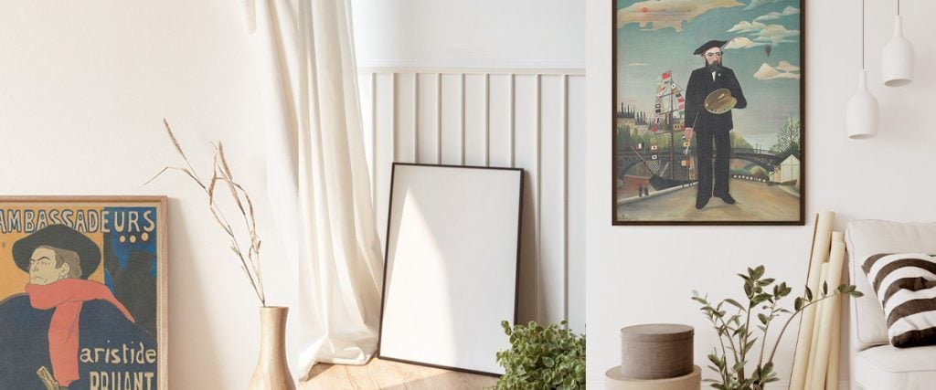
Adding a frame can be a great way to enhance the appearance of a decorative poster. However, make sure you choose the right frame to complement your poster. For a house with a minimalist interior style, you can use simple frames with thin lines and neutral colors, such as black, white, or wood. Avoid large or heavy frames because they can interfere with the beauty of the poster. For a more traditional or rustic room, frames with floral carvings, wood finishes, or metal are more suitable. Remember that the main goal is to make your poster stand out from its frame, not the other way around!
5. Incorporate Mixed Media

Combine a variety of artistic media such as watercolor, acrylic, markers, collage, or digital art to add texture and dimension to your poster. Mixing media allows you to create unique effects and enhance the overall aesthetic appeal. The style of mixing artistic media will make the poster even more unique and differentiate it from its usual appearance.
6. Experiment with Layering

Layering is a great way to make your poster look better. It involves adding depth and complexity to your design by arranging various elements such as images, text, and graphics in the foreground and background. This creates a multi-dimensional effect that makes your poster more attractive to look at. Using this technique, you can create a visually stunning composition that will impress your guests.
7. Embrace Empty Space
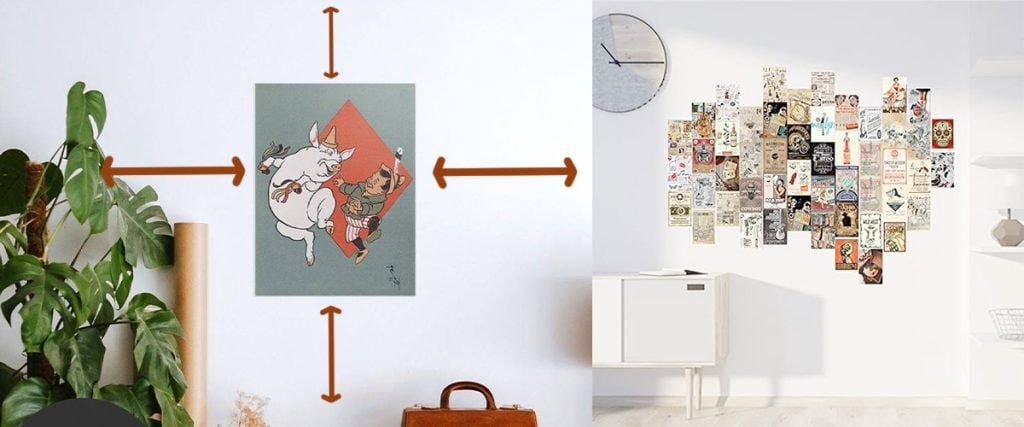
To make the posters look better, leave some space around them. The space left between the posters helps create balance and elegance. Additionally, the blank space can help create a clean and simple look, which will make important things stand out. Try to maximize different empty spaces to find the best balance for your design. It will make your posters look modern, minimalist, and refined.
Let’s Try Poster Decoration Ideas for Your Home!
Arranging posters for decoration may be a challenge for some people. Not everyone has a natural eye for design or a deep understanding of visual aesthetics. It requires an understanding of composition, balance, color harmony, and a little guidance. However, after reading the guide above, you no longer need to hesitate to install it.
Apart from easy guidance, Honpo also provides good-quality posters. If you are still in doubt, we provide consultations regarding installing posters or other wall decorations. For more details, visit our website or contact us directly. We wholeheartedly serve you.

